
Ian Ashdown, P. Eng., FIES, Senior Scientist, SunTracker Technologies Ltd.
Published: 2015/01/12
UPDATE 16/04/09 – This metastudy:
Fotois, S. 2106. “A Revised Kruithof Graph Based on Empirical Data,” Leukos. (Published online 08 April 2016, DOI 10.1080/15502724.2016.1159137.) critically examined 29 studies in which the Kruithof curve was investigated. The author concluded that “… these [studies] do not support Kruithof. For pleasant conditions, these data suggest only avoiding low illuminances and do not favor any CCT.”
After 75 years of misconception and misuse, may this finally mark the end of the Kruithof Curve. If a lighting designer has a personal preference for warm or cool colors, fine — but please, do not try to justify it with scientific mumbo-jumbo.
[UPDATE 15/01/20 – Added Bartleson (1960) reference.]
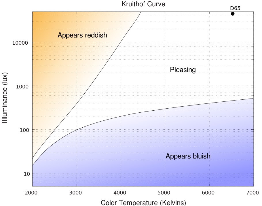
Lighting designers today will surely recognize the Kruithof curve, in which the color temperature of the light source is related to a range of illuminances that we find “pleasing.” In its modern form, the Kruithof curve has become supposedly irrefutable evidence that the correlated color temperature (CCT) of LED-based lighting should not exceed 4000K for indoor applications.
In the process, luminaire manufacturers are being lambasted for promoting products with CCTs of 5000K and higher. Worse, some government agencies and non-profit organizations are adopting CCT limits that are presumably based on the Kruithof curve. The DesignLights Consortium, for example, stipulates that luminaires on its Qualified Products List must have CCTs of 5000K or less for most indoor applications.
Unfortunately, the modern version of the Kruithof curve is different from what A. A. Kruithof published 75 years ago. The upper and lower curves are approximately the same, but their interpretation is different from what Kruithof intended. In fact, the Kruithof curve appears to have been basically misinterpreted for the past three-quarters of a century.
The Kruithof curve itself was thoroughly debunked a quarter-century ago with three exhaustive studies involving up to 400 participants (as opposed to two people in Kruithof’s study, including himself). The Kruithof curve was somewhat belatedly removed from the IES Lighting Handbook five years ago (IES 2010).
This article is however not so much about the validity of the Kruithof curve as it is about a careful re-examination of his 1941 paper. While Kruithof has been rightly criticized over the years for not providing experimental details, he wrote enough for us to infer how he arrived at his findings. When you realize that he was working with early prototypes of the first fluorescent lamps, it is in itself an interesting story.
In the Beginning
The year was 1941. Captain America made his first appearance in a comic book, Europe was being torn asunder by World War II … and Philips Research was quietly developing its own fluorescent lamp technology in Eindhoven, the Netherlands. As part of this effort, Philips Technical Review published a paper by A. A. Kruithof titled, “Tubular Luminescence Lamps for General Illumination” (Kruithof 1941).
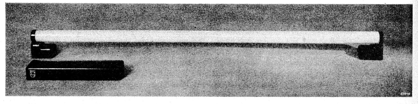
Kruithof’s paper was primarily about fluorescent lamp technology, which had been commercially released by General Electric in 1938. His experimental meter-long T12 “luminescence lamp” (FIG .2) was designed have a luminous flux output of 1000 lumens.
Halophosphate-based phosphors were not invented until the following year (McKeag and Ranby 1942), and so these “white” fluorescent lamps used a combination of cadmium borate, willemite (zinc orthosilicate), and magnesium tungstate, which respectively fluoresce red, green, and blue when excited by the ultraviolet radiation emitted by the mercury-argon gas fill.
By themselves, the phosphors resulted in maximum luminous efficacies of approximately 70 lumens per watt for willemite and 35 lumens per watt for cadmium borate and magnesium tungstate. By combining the phosphors in various proportions, it was possible to generate white light with CCTs ranging from 2650K to 10000K.
Kruithof fabricated fluorescent lamps with CCTs of approximately 4200K and 5800K, plus a third lamp type that was so far off the blackbody curve as to be considered colored rather than white. Comparing these to the extant incandescent lamp technology with its typical 15 lumens per watt luminous efficacy, Kruithof was well justified in writing, “These properties give reason to expect that luminescent lamps will be widely used in the future.”
Kruithof also performed an extensive analysis of the color rendering capabilities of his lamps by observing the color shifts of 313 color cards (as opposed to the eight colors used for the CIE General Colour Rendering Index Ra). Using the phosphor and visible mercury line spectra published in his paper, it is possible to estimate CRI values of his lamps as:
| Lamp CCT | Ra | R9 |
| 4200K | 36 | -110 |
| 5800K | 54 | -60 |
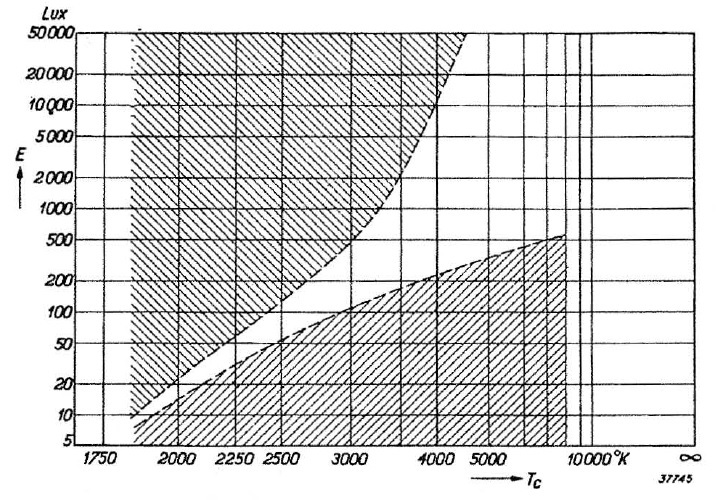
As for the original form of the Kruithof curve (FIG. 3), the paper includes a description of what the author referred to decades later as a “pilot study” of lamp CCT versus illuminance level. To fully understand this study, it is necessary to quote Kruithof (1941) extensively, beginning with:
“In the first place at a given level of illumination it is found that the colour temperature must lie within certain limits if the effect of the illumination is to be pleasing. Roughly, it may be said that a low or a high colour temperature corresponds to a low or a high level of illumination, respectively. We have investigated this relation experimentally somewhat more closely by introducing in a room a variable number of electric lamps whose current (i.e., the temperature of the filaments) could be varied.“
With vague phrases like “pleasing” illumination, “a room,” and a “variable number of electric lights,” we can at best only infer the experimental conditions that were used to develop this curve.
Kruithof continues:
“Below the lowest curve the illumination is ‘dim’ (at low colour temperature) or ‘cold’ (at high colour temperature). Above the highest curve the unnatural colour reproduction was unpleasant.“
There are two items of immediate interest here:
- Kruithof used the adjectives “dim” and “cold” rather than the modern interpretation of “appears bluish.”
- Kruithof used the adjectives “unnatural” and “unpleasant” rather than “appears reddish.”
It could be argued that the modern interpretation is intuitively valid, but that is not the point. Kruithof measured a specific psychometric parameter that he termed “pleasing” illumination. Recasting the results to support a different hypothesis effectively invalidates the experiment.
In terms of the illumination referenced in FIG. 1 appearing reddish or bluish, it must be noted here that no academic studies published to date support this hypothesis. The modern form of the Kruithof curve appears to be an interpretation with no scientific evidence to support it.
Continuing:
“These obviously vague limits within which the illumination is considered ‘pleasing’ could in our experiments be determined at least with an accuracy of 20 or 30 percent.”
This is a blazing red flag that something may be seriously wrong with this study — how can you measure something as subjective as “pleasing” with an accuracy of 20 to 30 percent in terms of illuminance? What Kruithof said — without providing any evidence — is that we can apparently tell the difference between say 100 lux and 125 lux of illumination. This is not a side-by-side comparison of two illuminated surfaces, but by simply walking into a room and deciding whether or not the colors are “unnatural.”
Much has been written in the following years that Kruithof did not provide any significant details of his experimental apparatus or protocols, and so it is difficult to accept the Kruithof curve as being valid. However, the rest of his paper is reasonably detailed and informative, indicating that Kruithof was a careful researcher. He must therefore have had some reason for claiming an accuracy of 20 to 30 percent.
Continuing with Kruithof, the extensive caption he wrote for FIG. 3 reads in part:
“The left-hand part of the limiting curves, up to a colour temperature of 2850 ºK, is recorded by allowing electric lamps with variable (decreased) current to burn in a room, and varying the number of lamps. The illumination intensity on a table 80 cm high was here measured. In the right-hand part the lowest level which does not give the impression of coldness was determined by experiments with daylight itself and with the daylight luminescence lamps to be described below.”
This is all frustratingly vague, but there is a key point: “… varying the number of lamps.”
Continuing:
“The shape of the upper curve has been extrapolated in this region with the help of the fact that in direct sunlight (colour temperature 5000 ºK) even with the highest illumination intensities occurring (104 or 105 lux) the colour rendering is never found ‘unnatural’.”
This is a crucial quote in that Kruithof decided that direct sunlight was not — and by definition could not — be “unnatural.” This brings us back to the question of the upper curve for color temperatures below 2850K (FIG. 3), where dimmed incandescent lamps were used.
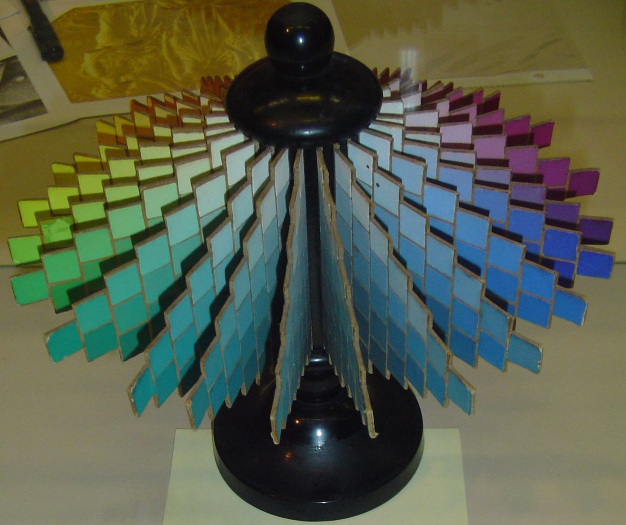
Looking deeper into the question of “unnatural color reproduction,” Kruithof stated that he used a selection of color cards from the Ostwald Color Atlas, a contemporary color classification scheme of the Munsell color system we use today (FIG. 4). With respect to this, he wrote:
“While the colour rendering can be judged by comparison when luminescence is used in combination with other light and the designation of the colour impression obtained and the saturation of the colour obtained must agree, when only luminescence lamps are used no comparison is possible. In judging the colour rendering therefore in this case one must have recourse to ‘colour memory’ which is chiefly confined only to the designation of colours.”
This is even more puzzling in that our ability to recall colors is mediocre at best. In general, we tend to remember colors as being more saturated than they really were (Bartleson 1960). It therefore makes even less sense that an accuracy (or more properly repeatability) of 20 to 30 percent could be perceived.
It does make sense, however, if Kruithof switched lamps on and off to vary the illuminance while maintaining constant color temperature. This would be a form of flicker photometry. We are mostly insensitive to absolute illuminances, but we are highly sensitive to changes in illuminance. Switching illumination levels would reveal even subtle changes in the perceived chromaticities of the color cards.
… which brings us to the first of two color appearance effects, the Bezold-Brücke hue shift effect. This effect was first reported in the 1870s, but it was not studied extensively until the 1930s (Purdy 1931). Even then, the study was published in the American Journal of Psychology. A lamp research engineer like Kruithof could be excused for not being aware of the paper and its implications.
The Bezold-Brücke effect results in perceived color hues changing with changes in luminance. As shown in FIG. 5, the wavelength shifts required to maintain constant perceived hue for monochromatic colors can be huge, particularly for red and cyan, with a ten-fold increase in luminance. The effect on Kruithof’s color cards would have been generally less noticeable, but may have been still evident with, for example, saturated red colors.

The second color appearance effect would not have been known to Kruithof because it was not reported until the 1950s. The Hunt effect (Hunt 1950, 1952, 1953) results in the perceived chroma (i.e., colorfulness) of illuminated objects increasing with increased illuminance. This effect is important enough to have been built into the CIECAM02 color appearance model that is widely used for color management for displays, printers, and other imaging devices.
For a given CCT, Kruithof presumably began with a low illumination level and then increased the illuminance until color appearance of the color cards more or less matched his color memory of them. The changes in perceived color would presumably be due to both the Bezold-Brücke and Hunt effects.
As however he continued increasing the illuminance, the continuation of these effects would result in the colors no longer matching his color memory. This would result in, to use Kruithof’s own words, “unnatural color reproduction.”
If Kruithof had reduced the daylight illuminance using, for example, neutral density filters, he would likely have observed the same behavior. However, even if he had done so, the time taken to move the filters into position would likely have masked the color differences. He also would have had the conundrum of having to call natural daylight “unnatural” and “unpleasant.”
In Kruithof’s defense, he may have been one of the first researchers to observe the Bezold-Brücke and Hunt effects using white light illumination with constant CCT. Certainly color shifts with changes in CCT were well-known at the time and modeled by the von Kries chromatic adaptation model. Color shifts with constant CCT were, however, a different matter.
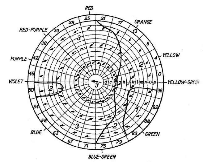
Kruithof was certainly aware of the color shifts that his fluorescent lamps produced, as shown by FIG. 6 and FIG. 7, where the circled areas labelled ‘2’ represent “clearly appreciable” color shifts.

Interestingly, Kruithof wrote:
“Most colours are somewhat less saturated in luminescence light than in daylight.”
which is exactly what you would expect from the Hunt effect. Nevertheless, Kruithof had little choice but to describe the 5800K lamp as generating “pleasing” illumination above some threshold.
It must be emphasized, however, that this is only a hypothesis — it would need a carefully designed large-scale experiment to determine whether in fact the Bezold-Brücke and/or Hunt effects can satisfactorily explain Kruithof’s results. Even then, it will be impossible to know with any certainty because Kruithof described his experiments so frugally. On the other hand, they at least offer a plausible explanation of his claim to 20 to 30 percent repeatability.
Time Marches On
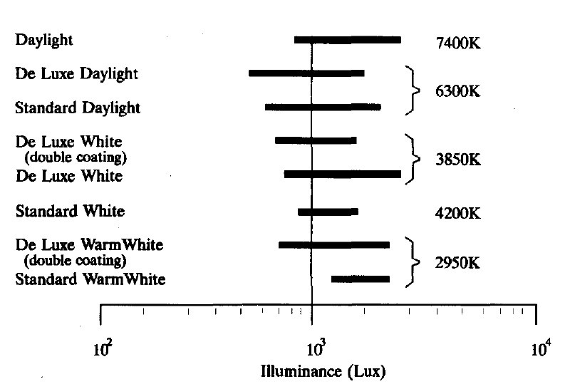
If Kruithof considered his work to be a mere “pilot study,” the follow-up studies have been anything but. Bodman (1967) for example performed studies wherein he varied the illuminance in a conference room illuminated by fluorescent lamps. Remarkably, more than 400 subjects took part in these studies. Like Kruithof, he found that people had a preferred illuminance range over which 90 percent of the subjects found the lighting to be “good.” However, As can be seen from FIG. 8, the preferences appear to be influenced more by the lamp spectral power distributions than by their CCTs. At the time that these studies were conducted, “deluxe” fluorescent lamps had CRI values of 90 or so, but warm white fluorescent lamps with their halophosphate phosphors had CRI values as low as 50.
What are interesting are the terms that Bodman’s subjects used to describe the lighting (FIG. 9). The warm white fluorescent lighting (CCT < 3000K) was described as “excessive” and “artificial” (terms which may have influenced by the low CRI values) at high illuminances, but for white (CCT ~ 4000K) and daylight (CCT > 6000K), the terms used were “pleasant” and “lively.” This is consistent with what you might expect from an increase in colorfulness as provided by the Hunt effect.

FIG. 9 – Subjective impressions of illumination levels (Bodman 1961).
Boyce and Cuttle (1990) performed similar experiments using fluorescent lamps with CCTs ranging from 2700K to 6300K, and with average illuminances ranging from 30 to 600 lux, to illuminate a small office space. All of the fluorescent lamps had CRI values ranging from 82 to 85.
Doing a detailed statistical analysis of 410 questionnaires completed by 15 subjects who spent 20 minutes becoming visually adapted to the room, the authors found that the lamp CCT had no statistically significant influence on the subjective assessments. Instead, the major factor in both color discrimination tests and subjective assessments was illuminance.
Interestingly, none of the subjects who were unfamiliar with lighting design used the terms “warm” or “cool” to describe the lighting.
Davis and Ginthner (1990) also performed similar experiments with 40 test subjects. Using 2750K and 5000K fluorescents lamps with CRI values of 90 and illuminance levels of 270, 600, and 1350 lux, they confirmed the findings of Boyce and Cuttle (1990) that the subjective ratings of preference were influenced by illuminance only. They also found that low light levels were rated as less colorful than high light levels for the same CCT, which again suggests the Hunt effect.
Finally, Viénot et al. (2008) performed experiments designed to investigate the validity of the Kruithof curve using LED modules rather than fluorescent lamps. To ensure high CRI with variable color temperature, they used LED clusters with independently-controlled blue, cyan, green, amber, orange, red, cool white, and warm white LEDs. These provided CRI values from 91 to 96 over an illuminance range of 150, 300, and 600 lux and a CCT range of 2700K, 4000K, and 6500K.
Unlike the previous studies, however,the Viénot et al. (2008) experimental setup was not a room but a light booth measuring some 41 x 35 x 38 cm (16 x 14 x 15 inches) that had an 80-degree field of view with a dark surround. It is debatable whether the results of the 20 subjects can be applied to offices spaces, but the authors concluded that:
“In one sense, we have validated Kruithof’s statement that high CCT at low illuminance is unpleasant. Nevertheless, we cannot conclude that low CCT should be confined to low illuminance to arouse pleasant sensations.”
and:
“When the colour rendering index is very high and the light spectrum is under control, there is no indication that high colour temperature is judged more pleasant than low colour temperature at higher illuminance levels.”
Summary
There have been many more studies related to the Kruithof curve, including Cockram et al. (1970), Denk et al. (2014), Dikel et al. (2014), Fotois et al. (2013), Hu et al. (2006), Ishi and Kakitsuba (2003), Juslén (2006), Küller et al. (2006), Logadóttir and Christoffersen (2008), Mills et al. (2007), Naoyuki and Tomimatsu (2005), Navvab (2001), Park et al. (2010), Pinto et al. 2008), Weintraub (2000), and Zhai (2014).
None of these, however, are as focused or comprehensive as those of Bodman (1967), Boyce and Cuttle (1990), and Davis and Ginthner (1990). The common conclusion of these authors is that while dim lighting at any CCT is seen as unpleasant, there is no observational evidence in support of Kruithof’s upper curve (FIG. 3).
What this discussion has shown, however, is that Kruithof may not have meant “unpleasant” in the sense of poor lighting quality, but rather in the sense of optimal color reproduction.
It must remembered that Kruithof was working with incandescent lamps with CCTs varying from 1800K to 2850K, 4000K and 5800K fluorescent lamps that probably had CRI values of less than 60, and “natural” daylight with unknown CCT. He likely would have never seen chromaticity shifts with changes in illuminance at constant CCT prior to his experiments, and probably (and quite reasonably) saw them as unnatural and hence unpleasant. This despite the fact that he observed exactly this when comparing his 5800K lamp with daylight, and explicitly commented on the fact.
Conclusion
The conclusion is straightforward, and indeed was established more than a quarter-century ago with three major studies: the Kruithof curve is essentially meaningless. There is no upper boundary to “pleasant” illumination at any CCT, and the best that can be said about the lower boundary is the obvious: dim lighting can be unpleasant, regardless of the CCT.
At the same time, however, Kruithof deserves credit for having been the first to investigate the topic. His failure to describe his experiments in more detail is regrettable, but perhaps understandable. Done as a pilot study, the brief discussion in his paper is basically a progress report with preliminary findings.
It has basically been through our continued misunderstanding of his term “pleasing” that the Kruithof curve continues to persist in lighting design practice. If Kruithof were able to comment on this today, he would likely have only two words to say (in Dutch):
“Stop daarmee!” (English translation: “Stop that!”)
References
Bartleson, C. J. 1960. “Memory Colors of Familiar Objects,” Journal of the Optical Society of America 50(1):73-77.
Bodman, H. W. 1967. “Quality of Interior Lighting Based on Luminance,” Transactions of the Illuminating Engineering Society of Great Britain 32(1):22.
Boyce, P. R., and C. Cuttle. 1990. “Effect of Correlated Colour Temperature on the Perception of Interiors and Colour Discrimination,” Lighting Research and Technology 22(1):19-36.
Cockram, A. H., J. B. Collins, and F. J. Langdon. 1970. “A Study of User Preferences for Fluorescent Lamp Colours for Daytime and Night-Time Lighting,” Lighting Research & Technology 2(4):249-256.
Davis, R. G., and D. N. Ginthner. 1990. “Correlated Color Temperature, Illuminance Level, and the Kruithof Curve,” Journal of the Illuminating Engineering Society 19(1):27-38.
Denk, E., P. Jimenez, and B. Schulz. 2014. “The Impact of Light Source Technology and Colour Temperature on the Well-being, Mental State and Concentration of Shop Assistants,” Lighting Research & Technology (in press).
Dikel, E. E., G. J. Burns, J. A. Veitch, S. Mancini, and G. R. Newsham. 2014. “Preferred Chromaticity of Color-Tunable LED Lighting,” Leukos 10(2):101-115.
Fotois, S., S. Atli, C. Cheal, K. Houser, and A. Logadóttir. 2013. “Lamp Spectrum and Spatial Brightness at Photopic Levels: A Basis for Developing a Metric,” Lighting Research and Technology 0:1-23.
Hu, X., K. W. Houser, and D. K. Tiller. 2006. “Higher Colour Temperature Lamps May Not Appear Brighter,” Leukos 3(1):69-81.
Hunt, R. W. G. 1950. “The Effects of Daylight and Tungsten Light-Adaptation on Color Perception,” Journal of the Optical Society of America 40(6):362-371.
Hunt, R. W. G. 1952. “Light and Dark Adaptation and the Perception of Color,” Journal of the Optical Society of America 42(3):190-199.
Hunt, R. W. G. 1953. “The Perception of Color in 1º Fields for Different States of Adaptation,” Journal of the Optical Society of America 43(6):479-484.
IES. 2010. IES Lighting Handbook, Tenth Edition. New York, NY: Illuminating Engineering Society.
Ishi, M., and N. Kakitsuba. 2003. “Preferred Color Temperatures at 200 lx during Exposure to Cool or Warm Environments for Middle-Aged Female Subjects,” Journal of the Human-Environmental System 6(2):93-100.
Juslén, H. 2006. “Influence of the Colour Temperature of Preferred Lighting Level in an Industrial Work Area Devoid of Daylight,” Ingineria Illuminatului 18(8):25-36.
Kruithof, A. A. 1941. “Tubular Luminescence Lamps for General Illumination,” Philips Technical Review Vol. VI, No. 3, pp. 65-73.
Küller, R., S. Ballal, T. Laike, B. Mikellidesa, and G. Tonello. 2006. “The Impact of Light and Colour on Psychological Mood: A Cross-Cultural Study of Indoor Work Environments,” Ergonomics 49(14):1496-1507.
Logadóttir, A., and J. Christoffersen. 2008. “Individual Dynamic Lighting Control in a Daylit Space,” Proc. Eleventh International Conference on Indoor Air Quality and Climate (Indoor Air 2008). Technical University of Denmark.
McKeag, A. H., and P. W. Ranby. 1942. Great Britain Patent 578,192. Improvements in Luminescent Materials.
Mills, P. R., S. C. Tomkins, and L. J. M. Schlangen. 2007. “The Effect of High Correlated Colour Temperature Office Lighting on Employee Wellbeing and Work Performance,” Journal of Circadian Rhythms 5(2):1-9.
Naoyuki, O., and N. Tomimatsu. 2005. “Preference on Illuminance and Colour Temperature of Interior for Various Behavior Settings,” Proc. 2005 Annual Conference of the Illuminating Engineering Institute of Japan (in Japanese).
Navvab, M. 2001. “A Comparison of Visual Performance under High and Low Colour Temperature Fluorescent Lamps,” Journal of the Illuminating Engineering Society 30(2):170-175.
Park, B.-C., J.H. Chang, Y.-S. Kim, J.-W. Jeong, and A.-S. Choi. 2010. “A Study of the Subjective Response for Corrected Colour Temperature Conditions of a Specific Space,” Indoor and Built Environment 19:623-637.
Pinto, D. P., J. M. M. Linhares, and S. M. C. Nascimento. 2008. “Correlated Color Temperature Preferred by Observers for Illumination of Artistic Paintings,” Journal of the Optical Society of America 25(3):623-630.
Purdy, D. M. 1931. “Spectral Hue as a Function of Intensity,” American Journal of Psychology 43:541-559.
Wyszecki, G., and W. Stiles. 1982. Color Science: Concepts and Methods, Quantitative Data and Formulae, Second Edition. New York, NY: John Wiley & Sons.
Viénot, F., M.-L. Durand, and E. Mahler. 2009. “Kruithof’s Rule Revisited Using LED Illumination,” Journal of Modern Optics 56(13):1433-1446.
Weintraub, S. 2000. “The Color of White: Is there a ‘Preferred’ Color Temperature for the Exhibition of Works of Art?”, Western Association for Art Conservation Newsletter 21(3).
Zhai, Q.-Y., M.-R. Luo, and X.-Y. Liu. 2014. “The Impact of Illuminance and Colour Temperature on Viewing Fine Art Paintings under LED Lighting,” Lighting Research & Technology 2014 (in press).
0 Comments